The Rise of the Seaport(s)

Last week I attended the South Boston Waterfront Sustainable Transportation Plan Community Meeting at the BCEC.  The meeting was in a back room of the incredibly massive Convention Center and while walking the full length of the building I thought to myself "If you can walk through four neighborhoods without leaving the building, the building is too big".  I then thought to myself, "Well, what neighborhoods?"  

South Boston Waterfront's potential neighborhood divisions

The meeting eventually broke down into a group of charettes for brainstorming ideas about how to deal with the future of the area's transportation needs.  The issue of the defining the neighborhoods that surround the BCEC has been playing loosely in my head for some time now, so the meeting seemed a good time to open up a discussion on this topic.  The area that the Boston Redevelopment Authority calls the "South Boston Waterfront" is roughly the same in area as the main peninsula of Boston: from Arlington St in Back Bay to the water's edge in the North End (this part of the city is home to about nine distinct neighborhoods).  The idea, therefore, that the area called "South Boston Waterfront" (SBW) could ever be thought of as one neighborhood is fairly preposterous, especially when one considers South Boston's growth and the degree to which the borders of Southie and the SBW are beginning to interact developmentally.  

The SBW is also called Fort Point, the Seaport District, and the Innovation District - all names that make sense to some degree but not as labels for the entire area.  The name of a place can significantly effect how people perceive it, and not having a name at all can be particularly challenging to an area trying to establish itself, especially if through that establishment it hopes to achieve a certain experiential and spatial quality and attract a specific type of people.  As development continues in the SBW and South Boston, I would propose that the City endeavors to determine clear boundaries for the neighborhoods that already exist and are growing in the area.  Furthermore, embarking on wayfinding and branding measures in these neighborhoods will help them grow into the healthy and vibrant types of places upon which the city hopes to build its future.  Below is how I would implement the nomenclature already in use to meaningfully define distinct parts of the SBW.

Fort Point  

By far the easiest neighborhood to understand, Fort Point is the 19th- and 20th-century neighborhood of warehouses now made up of artist communities, hip coffee houses, galleries, high dining, design offices, and museums.  It's a pleasantly healthy mix of uses, with offices, residences, and retail coexisting peacefully.  As new development has come to the area, it has been fit in fairly successfully as can be seen at Gerding Edlen's new residential building "315 on A".  The BRA defines the neighborhood as spreading from Seaport Blvd in the north to West 2nd St in the south, the Fort Point Channel in the west, and South Boston Bypass Rd in the east. Apart from the fact that this includes the Gillette Factory, it seems quite fair especially because it reaches out to Fort Point's little sister to the southeast, Channel Center.  The area between the two, currently occupied by parking lots, has been masterplanned to be built with the refined street grid of traditional Fort Point and will see a mix of contextually massed buildings and open space.  

Harborside

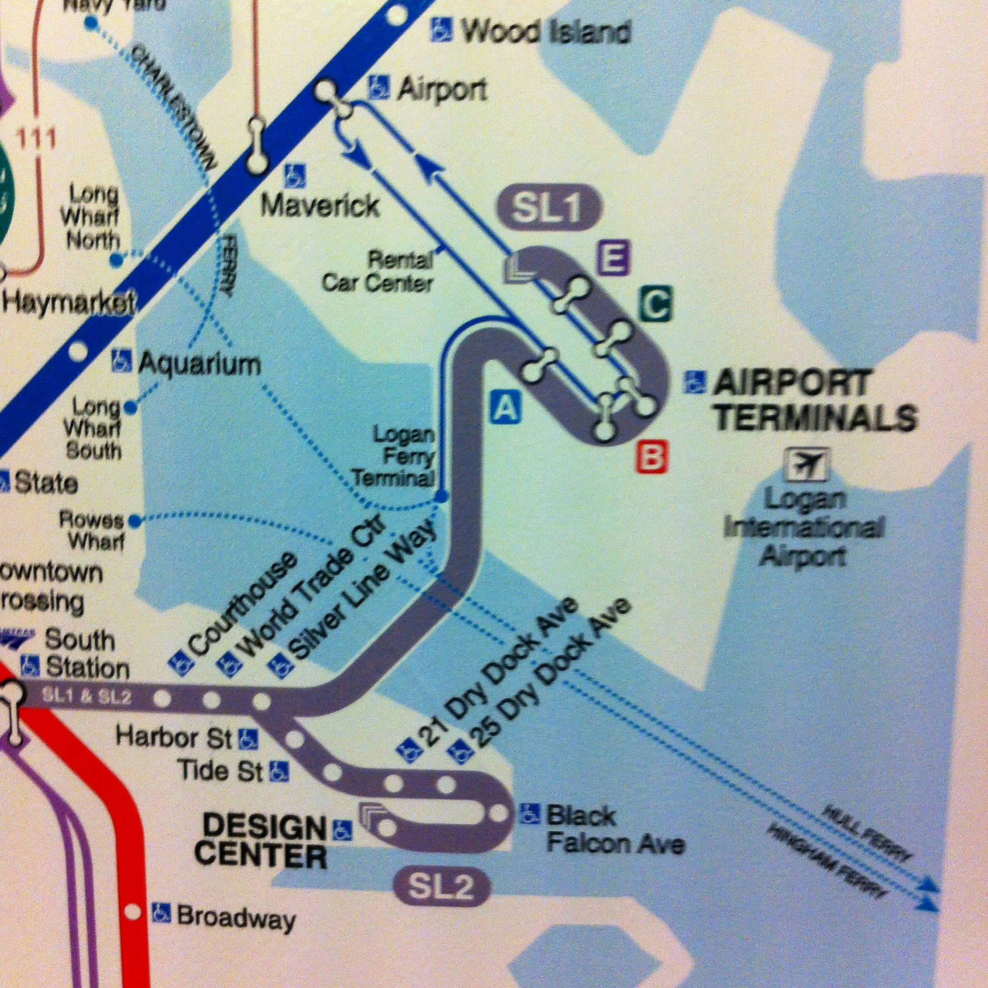
At present, the tendency is to refer to everything between Fort Point Channel, Reserved Channel, Boston Harbor, and West 1st St as the South Boston Waterfront; this is ridiculous as much of this area is neither near the water nor does it have any real interaction with it.  I would suggest that we reserve such a label for the portion of the city that is actually on the water and functions - or soon will - as a waterfront neighborhood.  Bounded to the north by the Harbor, the southern border from west to east would be Northern Ave to Seaport Blvd, Seaport Blvd until B St, B St until Congress St, Congress St until Starboard Way, Starboard Way to Triling Rd, and Trilling Rd back up to Seaport Blvd.  Essentially, the blocks adjacent to actual water or the piers upon which most waterfront-style action occurs.  

Seaport

The Boston Marine Industrial Park is the city's main functioning seaport.  Home to two drydocks and a variety of industrial uses, it is an area where residential development is prohibited. However, concentrating USPS, FedEx, Verizon and other similar large-scale infrastructural and industrial facilities here would open up a lot of land elsewhere for urbanistically healthier uses. It's a seaport, so we might as well call it Seaport. 

Convention Center

As the BCEC makes plans to expand, hotels get built along D St, and the intersection of D and Summer Sts becomes the focus of large, BCEC-centric development, I think that we are likely to see the rise of a new neighborhood within the next few years, especially as plans move forward for a new public space on D St.  Bounded roughly by Summer St, to the north, E St to the east, the BCEC to the west, and West 1st St to the south, this neighborhood will likely have a very processed vibe and be dominated by big-name hotels and fancy restaurants catering to convention-goers with company credit cards and therefore be set apart from the more vibrant and permanent populations of the surrounding neighborhoods. 

Innovation District

Much discussed and yet completely ephemeral, the "Innovation District" has yet to find itself physicalized.  A product of the Menino Administration's attempt to brand the SBW and rebrand Fort Point, the Innovation District is supposed to be a cross between arts and science, business and pleasure, professional lunches and high-society dinners.  I would argue, therefore, that it should eventually find its home anchored around District Hall in the neighborhood no-man's-land between Fort Point, Harborside, and Convention Center, the three of whose character it is essentially an amalgam of. Currently, much of this land is planned as "Seaport Square", whose slow construction may allow for a more organic and innovative development pattern capable of properly tackling some of the urban oddities like highway chasms, perpendicular streets that run 20 feet below each other, and the daunting fortress of the BCEC's western wall.  District Hall will be the Innovation District's spiritual heart as it weaves itself between the SBW's other neighborhoods acting as a conceptual and physical bridge between them all.  

SoCo

Despite my desire to see the Innovation District pop up in the area planned for Seaport Square, I think it will most likely find itself growing wherever the most amount of housing is built in the SBW.  The current dearth of available housing, whether for rent or purchase, means that the creative class who would otherwise inhabit the Innovation District and who already work in the surrounding neighborhoods are largely finding that they have to live further down the Red Line in Cambridge, Somerville, Southie, and Dorchester, which is also exacerbating the SBW's significant traffic congestion.  Wherever in the SBW reasonably priced housing is built, these people will move, in the process creating a modern neighborhood with a Fort Point-meets-Portland vibe.  While I think the area planned as Seaport Square would be ideal for large quantities of housing, there is also an unplanned industrial area to the south of the Convention Center neighborhood bounded by E St., West 1st St, Pappas Way, and Summer St., which has seen significant road investment lately, and while a bit off the beaten path and far from transit access, could prove quite valuable with some rezoning.  Regardless of whether this area is where the Innovation District plants its roots, I think it will have an accidentalness to its developmental nature and a name like "SoCo" (South of the Convention Center) carries a sense of self-referential irony that its likely inhabitants would appreciate.  

Mappuracy Matters

Over the past week, the MBTA has started rolling out their new maps, largely on Green Line trolleys.  I imagine the sudden release after months of silence regarding the fate of the winning map from last year's competition has something to do with the influx of visitors the city expected during Marathon weekend.  The Green Line and Silver Line to the airport are, of course, of particular importance to many visitors and runners.  Unfortunately, the new maps have a number of inaccuracies and confusing representational tactics throughout but especially along these lines.  A number of these problems are the result of the redrawing done to the map by the MBTA after it was originally submitted to them by Michael Kvrivishvili, but some of them were inherent in Kvrivishvili's map to begin with.  

Now after having created, publicized, and garnered a bit of praise and publicity for my version of the T map (not to mention printing and mailing 4x4ft versions to Secretary Richard Davey and MBTA GM Dr. Beverly Scott), I am uniquely frustrated to find that the map of a man who has never even ridden the T is being put into place and providing the citizens and visitors of the city I love so fiercely with incorrect and misleading information.  The T's new map can be seen below on the left and my version of the map is on the right. 

It is simply embarrassing for our city.

It is a step away from the new Boston of innovation, excellence, and thoughtfulness that our leaders tell us they are trying to create and that we are all fighting to see shine.

And frankly, I don't understand how a city purportedly trying to retain young talent and reinvent itself through the inventiveness of homegrown designers, thinkers, and similar professionals, chooses inaccurate maps made in Russia over accurate ones made in Boston.  

Full disclosure: I had a brief conversation with MBTA GM Dr. Beverly Scott last night and she expressed genuine interest in working together to correct these problems, which may or may not lead to replacing the map.

Rant completed, below are my comments on the shortcomings of the MBTA's new system map.  The images on the left are of the new map, and those on the right are the correlative part of the system as represented on my version of the map.

Innacuracies

Silver Line

By far the most problematic part of the map and, to be fair, the most difficult to represent accurately, is the Silver Line to the Airport and through Seaport.  As the T's new map depicts it, the SL1 goes to Terminal E at the Airport, then turns around and hits all the other terminals on its way back into town (maybe).  In the editing process, the T made the route curvy for no apparent reason and added that silly little arrow at the end that tells riders basically nothing.  To me it says "the SL1 travels in only one direction.  It goes to Logan and never comes back - have fun taking the Blue Line to town!"  Basically the same is represented for the SL2 in Seaport.  

What actually happens at the Airport is that after Terminal E the SL1 continues on its route without stopping anywhere until it gets back to Silver Line Way on the other side of the Harbor.  For its part, the SL2 makes a loop around the Design Center, making two stops, and then meets back up with its route at Tide St.  All of these crucial differences can be clearly seen on my map.   

This is also a good time to point out the glaring omission of the entire Fort Point Channel on the new map - something I deem inexcusable particularly on a map that decides (for no reason I can understand) to underlay a georealistic outline of the city instead of a much cleaner, abstracted, and crucially malleable outline.  Leaving out such an important geographic feature will have significant negative impacts on how people perceive and understand where they are when in the Fort Point/Seaport/South Boston Waterfront/Innovation District in relation to the rest of the city. 

Wonderland Buses

This has been a long-standing problem.  Because of the system of representation employed by the new T maps as well as the old ones, it is tremendously unclear what happens with the 116 and 117 bus, two routes that receive very heavy ridership and serve neighborhoods that are highly dependent on them.  The new T map suggests that the 117 stops at Revere Center (the brown dot on the left of the image), then Revere Beach on the Blue Line, then Wonderland, and then perhaps overlaps the route of the 116 to go back to Revere Center.  Similarly, it suggests that the 116's route is Revere Center, Wonderland, Revere Beach, Revere Center.  On my map, I made the important decision to show bus terminal stops so you can clearly see that the 117 terminates at Wonderland, and then retraces its steps through Revere Beach and Revere Center, and that the 116 also terminates at Wonderland and then heads back to Revere Center.  This is small, but so crucial. 

Dudley

Speaking of bus terminals, let's talk about Dudley.  Can anyone tell what's happening in the image on the left?  I honestly cannot.  The current representation makes it so difficult to keep the bus routes clear. By implementing a tactic for showing bus terminals on my map, riders can clearly see that the 1 and 66 buses end at Dudley instead of bleeding into other routes.  The same is true for the 15, 23, 28, and 22 at Ruggles where if it weren't for the terminals being shown it would look like all four routes overlap each other. Furthermore, I don't understand what's going on at the three Indigo Line stops that are shown.  Do the buses that go to each of them stop three times at each?  Is that what the three-pronged transfer means? On my map, passing through a station equates to a transfer - that seems fairly obvious.  Buses, particularly in Roxbury and Dorchester, are the workhorse of the MBTA and their representation on maps must be treated with care and precision.  

Confusions/Mistakes

Government Center

Showing that Government Center station is closed on printed maps means that within two years when the station reopens all the maps in the system will need to be reproduced, for such a cash-strapped agency, that seems a very liberal expenditure.  I feel that the stickers the T has been placing on maps throughout the system highlighting Government Center's closure are an ideal way to depict this. Additionally, the fact that the map doesn't have enough space to allow Government Center, one of the most important stations in the system, to have its label fully written out is concerning and doesn't bode well for any future expansions or edits.  

Angled Labels

It's generally agreed upon amongst transit mappers that angled labels are to be avoided as much as possible.  The new T map puts five of the most important Green Line stops, Kenmore through Boylston, at a 45 degree angle.  Furthermore, it repeatedly switches which side of the line the labels are on making for even more confused reading. 

This is also as good a time as any to point out that the georealistic map underlay makes for some very unsightly visual relationships.  Note how awkward "Hynes Convention Center" looks angled at 45 degrees against the Charles flowing by behind it.  

Green Line

In addition to not showing that the B, C, and E branches are not grade-separated and therefore operate more like streetcars, the new T map also suggests that the D branch is about the same length as the other Green Line branches and that Riverside is somewhere between Cleveland Circle and Heath St.  Of course, this is not true: the D is approximately twice as long a line as the B and C and nearly four times the length of the E.  This, along with not showing anu difference between grade-separated and at-grade lines can lead to significant confusion about what the Green Line is, how it operates, and what options riders have when planning a trip. 

Round Your Stroke

This is small but really irks me: someone forgot to round the stroke in Illustrator on the D branch so the stop mark for Riverside looks nubby and like it's half outside the line when compared to any of the other line termini.  

Where is Chinatown?

Partially because of the tightness that using a georealistic underlay creates for much of downtown Boston's depiction on the new T map, the label for the Chinatown stop on the Silver and Orange lines looks like it could apply to either South Station or Chinatown.  

There is also an incredible amount of inconsistency regarding SL to subway transfers.  The SL4 and SL5 never go underground or into any subway stations but the 1 and 2 do, this could be something worth noting on the map.  At South Station and Boylston it looks like the new T map is trying to illustrate this by using a split transfer symbol instead of a unified one like the SL1 and SL2 at South Station.  However, then the whole idea falls apart because a unified transfer symbol is used at both Tufts Medical Center and Chinatown where the SL4 and SL5 definitely do not go underground or into the station.  

Mapping America's Financial Nations

The biannual listing of the Global Financial Centers Index was recently released and the headline-worthy news from it was that New York City has overtaken London as the global financial hub, if only by two points.  Of greatest interest to me, however, are the numbers lower down on the list - New York and London will always be the first and second so the order of their seats at the top of the list are fairly insignificant to an evaluation of the meaningfulness of this ranking.  While Boston fell one spot to eighth and was overtaken by Seoul (which jumped three spots) it remains the second largest financial center in the country, with San Francisco being the only other American city in the Top 10 globally.  

I see regionalism as an extended version of urbanism: both disciplines being about understanding the identity and dynamics of a space, just at different scales.  My thinking on this has been largely informed by Joel Garreau's 1981 book "The Nine Nations of North America" and more recently by Colin Woodard's "American Nations".  Both books seek to explore ideas for how North America should and is already divided into nine or eleven distinct nations, respectively, largely along the lines of the regions we already understand to exist.  Their approaches are quite different, but what they are essentially attempting to explain is an understanding of how the disparate parts of the US actually function.

Joel Garreau's nine North American nations (left) verses Colin Woodard's eleven (right).  Their approaches vary on a spectrum from observational anthropology to ethnocultural historic analysis.  

Looking at regionalism and the idea of New England's nationhood through the lens of financial ranking may not seem to have much significance, but these sorts of statistics really can have an impact on the idea of a place, and engage in complex cause-and-effect dynamics.  A simple example: saying Boston is the second largest financial center in the US is likely to encourage further financial activity and investment, thereby bolstering and affirming its ranking.  

The Federal Reserve Bank has divided the US into not nine or eleven, but rather twelve distinct districts (Hunger Games, anyone?)  Boston is home to the Federal Reserve Bank for the First District, which is coterminous with New England and is the only district to be so neatly defined along the boundaries of a spatially and legislatively formalized region of the US.  In fact, 11 states are divided amongst two of the other districts signifying that the Fed is keenly aware of the arbitrary nature of most state boundaries and understands that it is crucial to see the US along more meaningful dividing lines.  Indeed, Missouri is the only state to host two main Fed banks (in Kansas City and St. Louis) as its eastern half is in the Eighth District and its western half in the Tenth.

The Federal Reserve Bank's 12 districts.  Black squares represent each district's main office in (1) Boston, (2) New York City, (3) Philadelphia, (4) Cleveland, (5) Richmond, (6) Atlanta, (7) Chicago, (8) St. Louis, (9) Minneapolis, (10) Kansas city, (11) Dallas, and (12) San Francisco. The red dots represent smaller branch offices, and the headquarters of the Fed in DC (which is not part of any district) is represented by the star in a black circle. 

In the small districts of the Northeast, every major city of the Bos-Wash megalopolis (Boston, New York, Philadelphia, the District of Columbia [and Richmond if we wish to extend it that far]) is the home city for the main branch of the Fed.  As opposed to the western districts where the distances between main offices are vast, the Fed recognizes that the densely populated northeast has many regions (or nations) and therefore has provided each district with a main office in distinct capital cities in which to do business.  

Boston's Federal Reserve Bank Tower designed by Hugh Stubbins in 1969 is the tallest Fed building and sometimes referred to as the world's largest washboard.  

That Boston is understood by the Fed to be the seat of a distinct financial region, and is the US's second largest financial center, despite being the closest on the list to New York and having a drastically smaller population, suggests that New England as a region, district, and nation is uniquely solidified and bears a strong independence from the rest of the nation.  This certainly is not news to most New Englanders, but the degree to which Boston and New England can hold their own from a global financial standpoint is an important part of understanding the future role the region will play on the national and international stage.

MBTA Map + Proposal also on BostInno

After my interview with Nate Boroyan yesterday, I was asked to write a guest post for BostInno on my MBTA map for the existing system as well as my proposal for an expanded T system.  Check out the piece below!  It was quite such an honor getting to do this!

CommonRail Designer Talks Flaws With New T Map, Unveils His Improvements

The transit super-fans out there may recognize my name from an article that Nate Boroyan posted yesterday about me and CommonRail (see: above), my proposal for high-speed rail across New England. Today I’m writing about another transit mapping project that may hit a little closer to home for us Bostonians.

Anyone who followed the MBTA’s mapping competition this past year may know that the competition winner is a Russian graphicist who has never been to our fair city upon a hill.

I was in Paris at the time of the competition, and couldn’t get my map done on time. Upon returning home to Boston in May, I considered the final entries for the competition and when the winner was announced, was disappointed in the choice because - while generally an excellent map - it had some flaws that likely only a Bostonian well acquainted with the MBTA system would have noticed.

To me, Mikheil Kvrivishvili’s map’s greatest downfall was that it did not clearly distinguish between much of the B, C, and E Green Line branches, the Mattapan High Speed Rail Line, and parts of the Silver Line, none of which are grade separated, and the rest of the system, which is. To solve this problem, I made all non grade-separated service an outline of the corresponding grade-separated line.

I was also concerned about the fact that the winning map depicted bus lines in such a way that when two or more met and intersected it became unclear as to where one line terminated and the other continued. This can be particularly noticed at major bus terminals like Dudley, Ruggles, and Wonderland. To remedy this I devised a simple terminal marking and by making the lines thinner was able to include more information than Kvrivishvili’s map.

My map with markings...


Next, I attempted to tackle one of the greatest debates in transit mapping: that between georealism and pure diagrammatic abstraction. In the end, I weighed where it was important for people to understand accurately the geographic relationships between transit and the city - primarily in the downtown – and did my best to represent it by extending the D branch and reworking the SL2 in Seaport. I also cleaned up confusion about the order in which the SL1 visits the airport terminals.

The next challenge was my favorite because it begins to get at the future of how we will use the T. Between stations that are fairly close to each other, I added walking lines with Google estimated walking times. This is particularly helpful between Bowdoin and Charles/MGH for example, or Back Bay and Copley. It’s also a way of using time as an alternative measure to distance, much as I did with CommonRail.

Finally, my map also has a faded depiction of any under-construction or seriously planned additions to the system, most prominently the Green Line Extension to Somerville and Medford, but also the use of Track 61 between Seaport and Back Bay, the new Silver Line to Chelsea, the Assembly Sq. stop on the Orange Line, and the Boston Landing stop on the Framingham/Worcester Commuter Rail.

In addition to my new map for the existing system, I created a (very ambitious) proposal for a system of, say, 2024 that includes new Blue and Red Line branches, and a Silver Line train from Everett to Franklin Park that would replace the Sl4 & SL5. Both of these maps I printed at full-scale and sent to Secretary of Transportation Richard Davey and MBTA General Manager Dr. Beverly Scott. Within about a week Secretary Davey was kind enough to send me a handwritten note saying that he “loved” my ideas and that MassDOT is working hard to rebuild the excellent transit system the state once had.

As many may know, the MBTA had said that the first use of Kvrivishvili’s map would be at the recently rebuilt Orient Heights Station, but as far as I know, the map has not yet been put up there. The terms of the competition never promised that the winner would have their map used throughout the system, which has led me to wonder if the slow roll-out of Kvrivishvili’s map may mean that the one I created could still have a chance of seeing the light of day – or even better, the dark of a subway station. What do you think?"

BostInno Article about CommonRail

I was quite honored to be asked to do an interview about myself and CommonRail by Nate Boroyan at BostInno and here it is! 

"Here's the CommonRail. The rapid transit design proposes connecting some of New England's largest cities by train, at speeds approaching 100 mph.

While the design remains theoretical thus far, CommonRail architect Cyrus Dahmubed believes there is potential for this idea, or something similar, to become a realistic rapid transit option.

"I'd love to see some of it actually happen," Dahmubed told BostInno in a phone interview.

Dahmubed's CommonRail would offer:

  • Boston - Augusta: 1h 35min.
  • Boston - Newport/New Bedford: 40/30 min.
  • Boston - Providence: 25min.
  • Boston - Montreal: 2h 55min.
  • Boston - Hartford: 50min.
  • Boston - Albany (via Springfield): 1h 35min.
  • Boston - Albany (via North Adams): 1h 25min.

If this seems unrealistic – think again.

"Much of the track and right-of-way that it would need is already [in place] and would just need some upgrading and straightening," Dahmubed said, referencing comments he's received about the feasibility of his map.

A transit enthusiast, Dahmubed, born and raised in Newton, studied Visual and Environmental studies at Harvard University, before heading to Columbia University for a postgraduate program.

Despite being able to do so, Dahmubed doesn't have a license, he said. So, he's all too familiar with Amtrak trips and MBTA commutes from Riverside, he explained.

The CommonRail concept came to him about two years ago, when, Dahmubed said, he found himself making frequent trips back-and-forth, from Boston to Springfield, "visiting friends at Mount Holyoke."

"[The train trips] weren't great," added Dahmubed.

After spending a few months in Paris, traveling throughout Europe by train, he realized that New England would be the best region in United States for European-style rapid transit.

The CommonRail, he said, "would be a step forward for regional transport in New England." Now, people are starting to take notice of his concept.

He posted his CommonRail design on his website, iqubeddesign.com three days ago. And, before he knew it, the map found it's way to Curbedbefore cropping up on Reddit, this morning.

Before Dahmubed's CommonRail design surfaced on the internet, however, MassDOT secretary Richard Davey was presented with a personal print.

"I met [Davey] the other night," Dahmubed said, during a Capital Plan community meeting.

That wasn't the first time Dahmubed and Davey had corresponded, he explained. In fact, Davey had previously written him a note, after receiving fully printed copies of other maps designed by Dahmubed.

"In November," Dahmubed said, he sent Davey copies of a T map he had designed. That creation, Dahmubed said, he designed after noticing "some flaws" with the map produced by Mikheil Kvrivishvili, which was the winning submission in the MBTA map design contest."