
Over the past week, the MBTA has started rolling out their new maps, largely on Green Line trolleys. I imagine the sudden release after months of silence regarding the fate of the winning map from last year's competition has something to do with the influx of visitors the city expected during Marathon weekend. The Green Line and Silver Line to the airport are, of course, of particular importance to many visitors and runners. Unfortunately, the new maps have a number of inaccuracies and confusing representational tactics throughout but especially along these lines. A number of these problems are the result of the redrawing done to the map by the MBTA after it was originally submitted to them by Michael Kvrivishvili, but some of them were inherent in Kvrivishvili's map to begin with.
Now after having created, publicized, and garnered a bit of praise and publicity for my version of the T map (not to mention printing and mailing 4x4ft versions to Secretary Richard Davey and MBTA GM Dr. Beverly Scott), I am uniquely frustrated to find that the map of a man who has never even ridden the T is being put into place and providing the citizens and visitors of the city I love so fiercely with incorrect and misleading information. The T's new map can be seen below on the left and my version of the map is on the right.


It is simply embarrassing for our city.
It is a step away from the new Boston of innovation, excellence, and thoughtfulness that our leaders tell us they are trying to create and that we are all fighting to see shine.
And frankly, I don't understand how a city purportedly trying to retain young talent and reinvent itself through the inventiveness of homegrown designers, thinkers, and similar professionals, chooses inaccurate maps made in Russia over accurate ones made in Boston.
Full disclosure: I had a brief conversation with MBTA GM Dr. Beverly Scott last night and she expressed genuine interest in working together to correct these problems, which may or may not lead to replacing the map.
Rant completed, below are my comments on the shortcomings of the MBTA's new system map. The images on the left are of the new map, and those on the right are the correlative part of the system as represented on my version of the map.
Innacuracies
Silver Line
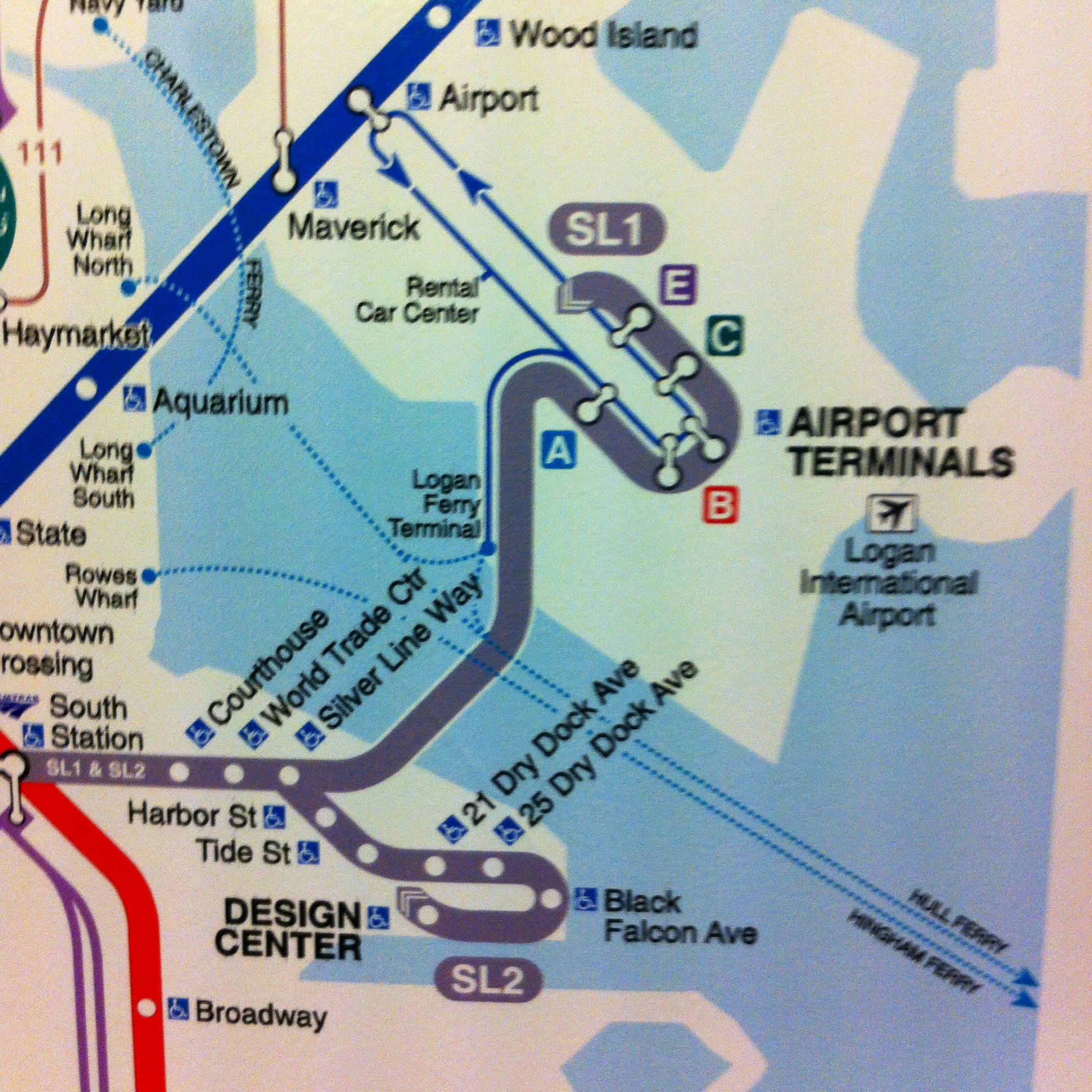
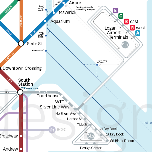
By far the most problematic part of the map and, to be fair, the most difficult to represent accurately, is the Silver Line to the Airport and through Seaport. As the T's new map depicts it, the SL1 goes to Terminal E at the Airport, then turns around and hits all the other terminals on its way back into town (maybe). In the editing process, the T made the route curvy for no apparent reason and added that silly little arrow at the end that tells riders basically nothing. To me it says "the SL1 travels in only one direction. It goes to Logan and never comes back - have fun taking the Blue Line to town!" Basically the same is represented for the SL2 in Seaport.
What actually happens at the Airport is that after Terminal E the SL1 continues on its route without stopping anywhere until it gets back to Silver Line Way on the other side of the Harbor. For its part, the SL2 makes a loop around the Design Center, making two stops, and then meets back up with its route at Tide St. All of these crucial differences can be clearly seen on my map.
This is also a good time to point out the glaring omission of the entire Fort Point Channel on the new map - something I deem inexcusable particularly on a map that decides (for no reason I can understand) to underlay a georealistic outline of the city instead of a much cleaner, abstracted, and crucially malleable outline. Leaving out such an important geographic feature will have significant negative impacts on how people perceive and understand where they are when in the Fort Point/Seaport/South Boston Waterfront/Innovation District in relation to the rest of the city.
Wonderland Buses
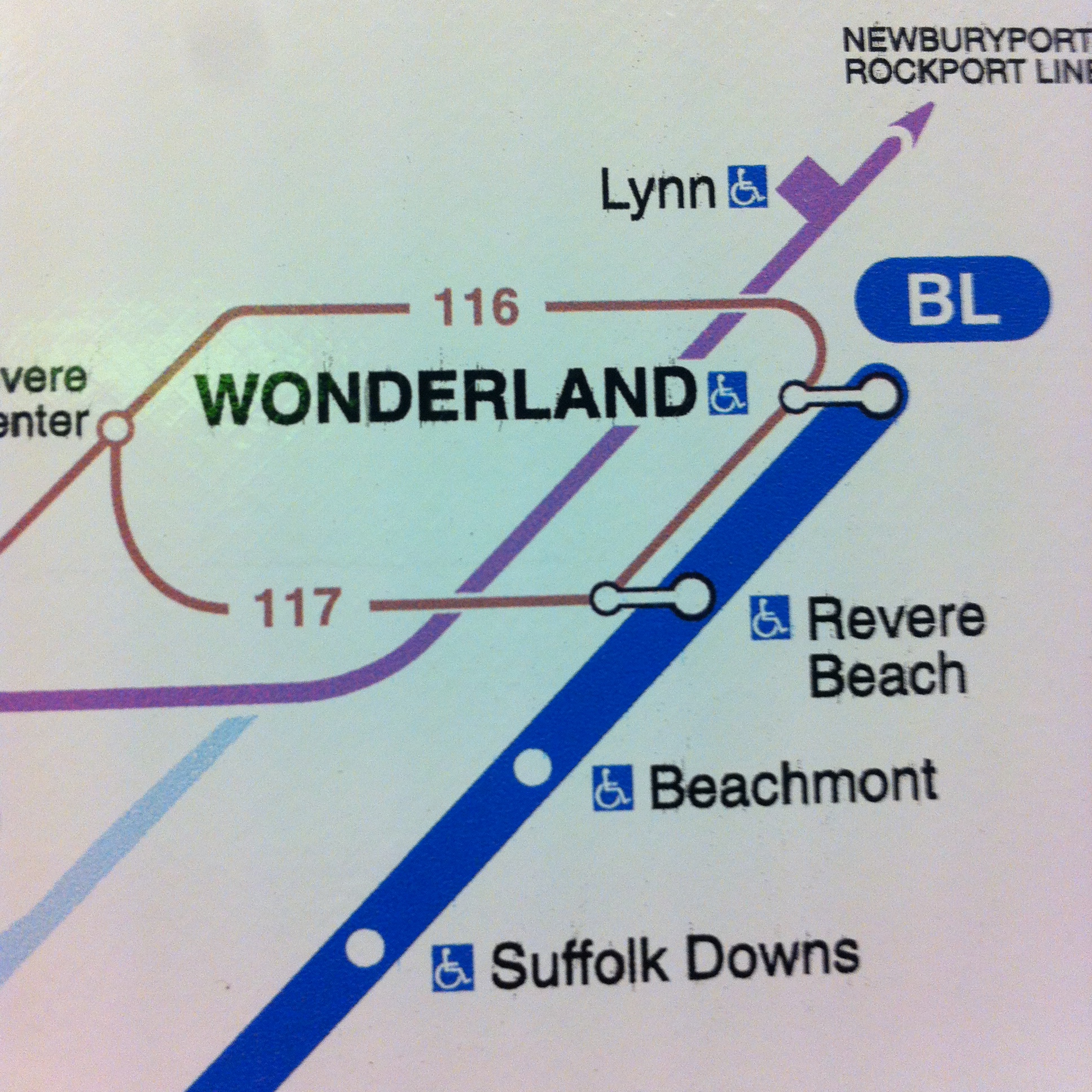
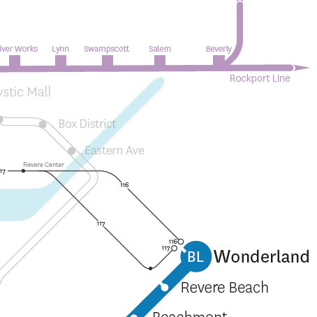
This has been a long-standing problem. Because of the system of representation employed by the new T maps as well as the old ones, it is tremendously unclear what happens with the 116 and 117 bus, two routes that receive very heavy ridership and serve neighborhoods that are highly dependent on them. The new T map suggests that the 117 stops at Revere Center (the brown dot on the left of the image), then Revere Beach on the Blue Line, then Wonderland, and then perhaps overlaps the route of the 116 to go back to Revere Center. Similarly, it suggests that the 116's route is Revere Center, Wonderland, Revere Beach, Revere Center. On my map, I made the important decision to show bus terminal stops so you can clearly see that the 117 terminates at Wonderland, and then retraces its steps through Revere Beach and Revere Center, and that the 116 also terminates at Wonderland and then heads back to Revere Center. This is small, but so crucial.
Dudley


Speaking of bus terminals, let's talk about Dudley. Can anyone tell what's happening in the image on the left? I honestly cannot. The current representation makes it so difficult to keep the bus routes clear. By implementing a tactic for showing bus terminals on my map, riders can clearly see that the 1 and 66 buses end at Dudley instead of bleeding into other routes. The same is true for the 15, 23, 28, and 22 at Ruggles where if it weren't for the terminals being shown it would look like all four routes overlap each other. Furthermore, I don't understand what's going on at the three Indigo Line stops that are shown. Do the buses that go to each of them stop three times at each? Is that what the three-pronged transfer means? On my map, passing through a station equates to a transfer - that seems fairly obvious. Buses, particularly in Roxbury and Dorchester, are the workhorse of the MBTA and their representation on maps must be treated with care and precision.
Confusions/Mistakes
Government Center


Showing that Government Center station is closed on printed maps means that within two years when the station reopens all the maps in the system will need to be reproduced, for such a cash-strapped agency, that seems a very liberal expenditure. I feel that the stickers the T has been placing on maps throughout the system highlighting Government Center's closure are an ideal way to depict this. Additionally, the fact that the map doesn't have enough space to allow Government Center, one of the most important stations in the system, to have its label fully written out is concerning and doesn't bode well for any future expansions or edits.
Angled Labels


It's generally agreed upon amongst transit mappers that angled labels are to be avoided as much as possible. The new T map puts five of the most important Green Line stops, Kenmore through Boylston, at a 45 degree angle. Furthermore, it repeatedly switches which side of the line the labels are on making for even more confused reading.
This is also as good a time as any to point out that the georealistic map underlay makes for some very unsightly visual relationships. Note how awkward "Hynes Convention Center" looks angled at 45 degrees against the Charles flowing by behind it.
Green Line
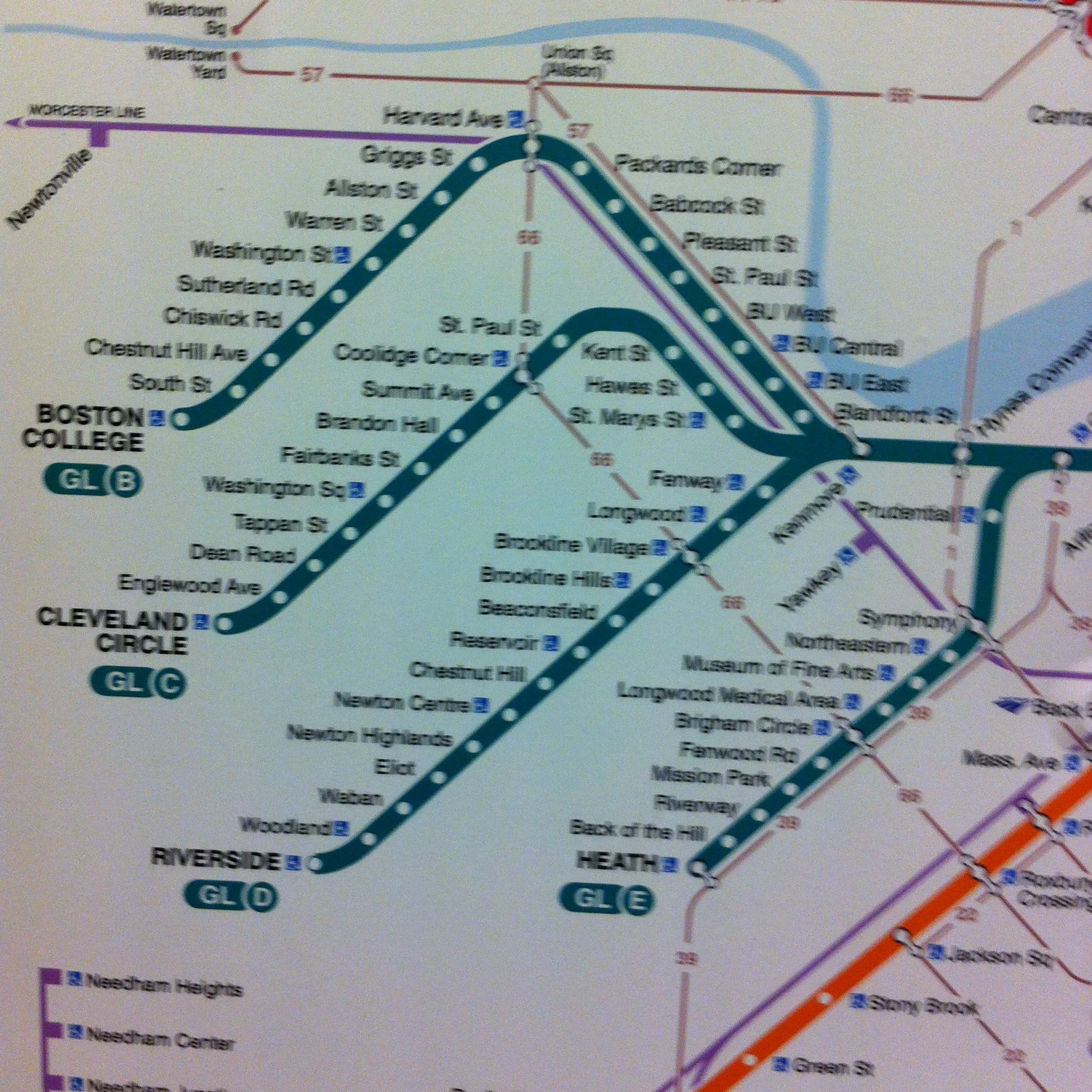
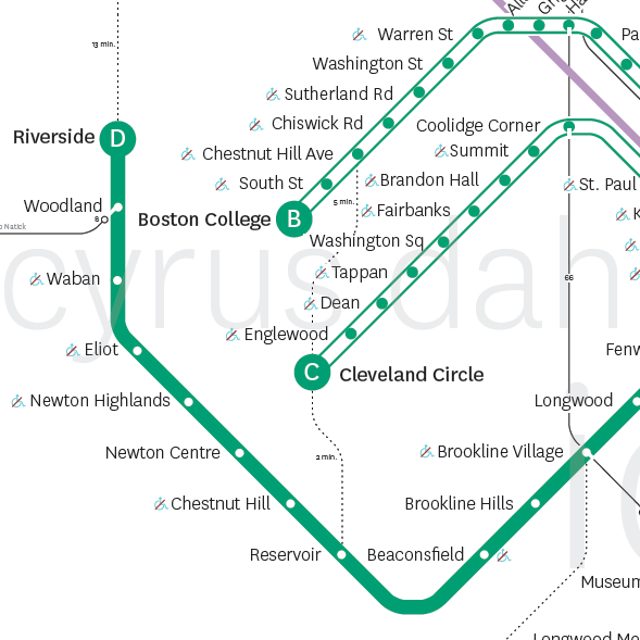
In addition to not showing that the B, C, and E branches are not grade-separated and therefore operate more like streetcars, the new T map also suggests that the D branch is about the same length as the other Green Line branches and that Riverside is somewhere between Cleveland Circle and Heath St. Of course, this is not true: the D is approximately twice as long a line as the B and C and nearly four times the length of the E. This, along with not showing anu difference between grade-separated and at-grade lines can lead to significant confusion about what the Green Line is, how it operates, and what options riders have when planning a trip.
Round Your Stroke


This is small but really irks me: someone forgot to round the stroke in Illustrator on the D branch so the stop mark for Riverside looks nubby and like it's half outside the line when compared to any of the other line termini.
Where is Chinatown?
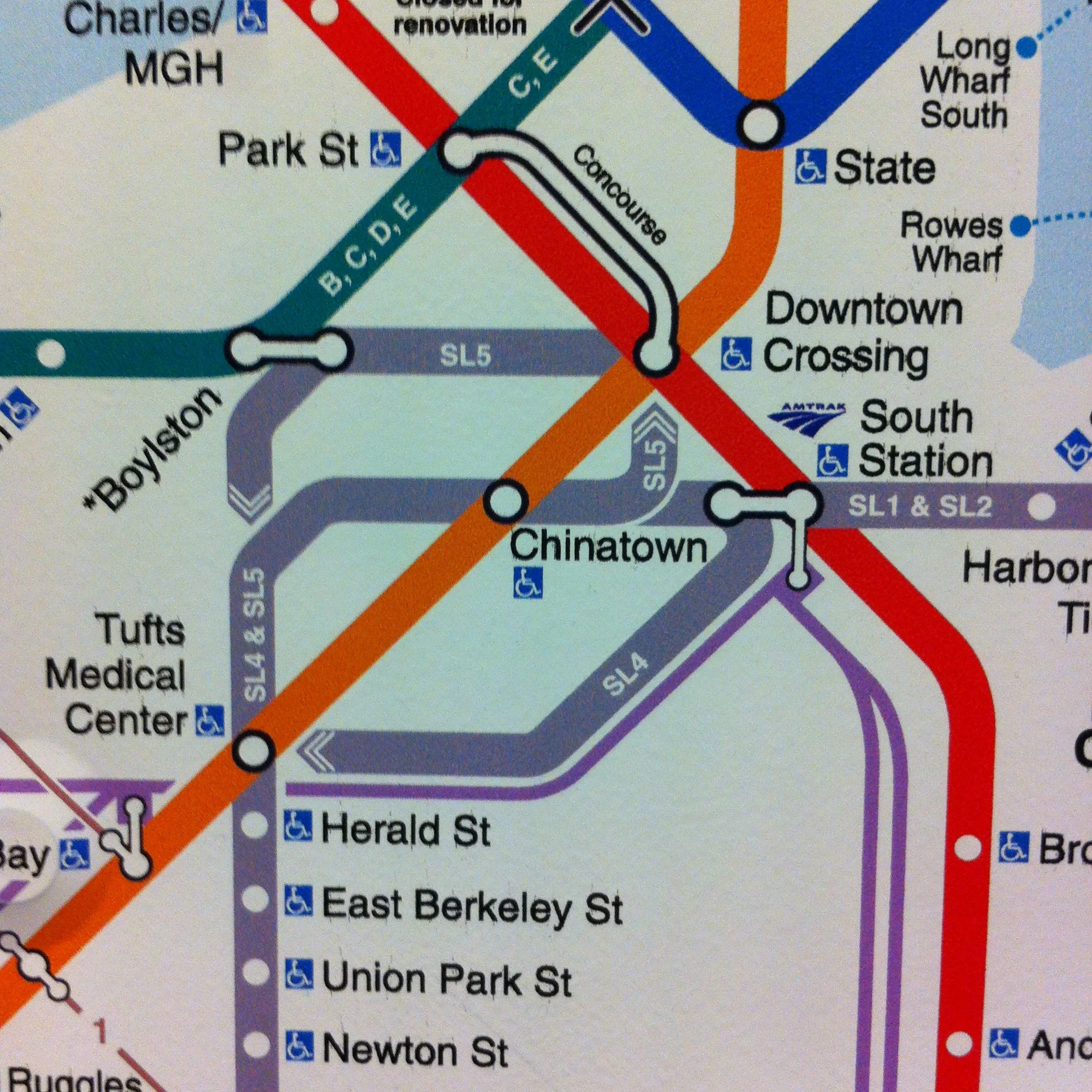

Partially because of the tightness that using a georealistic underlay creates for much of downtown Boston's depiction on the new T map, the label for the Chinatown stop on the Silver and Orange lines looks like it could apply to either South Station or Chinatown.
There is also an incredible amount of inconsistency regarding SL to subway transfers. The SL4 and SL5 never go underground or into any subway stations but the 1 and 2 do, this could be something worth noting on the map. At South Station and Boylston it looks like the new T map is trying to illustrate this by using a split transfer symbol instead of a unified one like the SL1 and SL2 at South Station. However, then the whole idea falls apart because a unified transfer symbol is used at both Tufts Medical Center and Chinatown where the SL4 and SL5 definitely do not go underground or into the station.