A recent proposal to squeeze an infill development into the courtyard of the 500 Boylston tower has received praise from urbanists and architects who argue that Boylston Street needs enhanced street life, denser development, and greater activation. Generally, these tenets hold true on most streets in most cities, and while one of the lessons of Boston’s dalliance with Modernist urbanism in the mid 20th-century was that we should keep our streetwalls tight and our neighborhoods dense, infill for the sake of infill is a precept that we have a responsibility to question. While CBT’s proposed design for the infill project is not a bad one, 500 Boylston’s courtyard is not a space we can afford to lose to a glass box, however engaging its undulations and renderings may be. I have written previously that as an architecture, 500 Boylston is more than meets the eye. Rather than simply being another Postmodernist (PoMo in the parlance of the moment) office tower, Philip Johnson and John Burgee’s 1987 project for Hines Interests is actually one of Boston’s and Postmodernism’s greatest architectural lessons, and as such, is worthy of preservation in its current form.
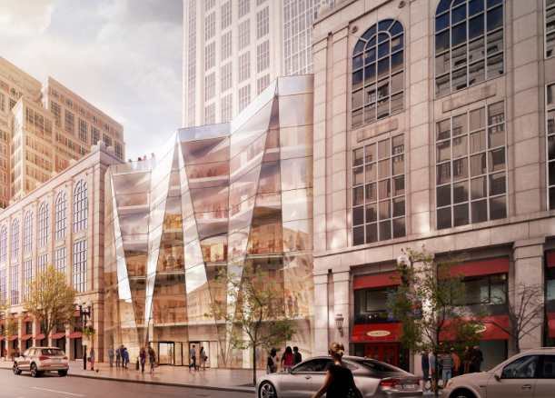
The proposed infill development by CBT Architects, from the PNF filed with the Boston Redevelopment Authority.
bit of history: I have argued in the post linked above that Johnson/Burgee - but likely Johnson in particular - were using 500 Boylston as a way to show Boston and the world that pushing Postmodernism to its logical extreme is not the way for architecture to be moving. The building is therefore both the style perfected and a scathing indictment of it. At the time of its conception, Bostonians had fallen in love with Postmodernism’s faux-classical approach to architecture, which involved slathering buildings in every bit of ornamentation possible as a rebuff to the austere severity of Modernism, and PoMo towers were popping up all over the city. Johnson, one of the greatest Modernists of his day, embraced PoMo’s oft-garish expressionism but ultimately returned to the purer forms of Modernism in his later work. Nevertheless, Boston wanted PoMo, and the BRA was pushing the development of towers along Boylston Street as part of its High Spine masterplan. Unsurprisingly, the development of 500 Boylston was still fraught with controversy. Neighbors and neighborhood associations battled Johnson/Burgee and the original developers resulting in the elimination of a few floors (sound familiar?) and giving the tower its rather squat proportions. The tower was ultimately built and dressed to the nines with every ornament Johnson/Burgee could throw at it, and when finished Bostonians decided they hated it. What was supposed to be an identical tower next door was scrapped because of community opposition to the tower’s squatness and an apparent realization that Postmodernism at its most Postmodernist extreme was actually something quite distasteful. Robert A. M. Stern was brought in to complete the second tower in a quieter, less opinionated fashion, and one can only assume that Johnson felt some vindication that Bostonians, it seemed, had learned their architectural lesson of the ‘80’s.
500 Boylston seen from within the courtyard, its Palladian window form and courtyard ornamentation are highlighted.
500 Boylston is a building we should respect not only because through its sagacious teachings it is a perfect architectural lesson, but also because it presents us with some very unique design. As the ultimate PoMo building, the tower’s form is taken explicitly from the Palladian window, itself a classically ornamented fenestration designed by original “starchitect”, 16th-century Venetian architect Andrea Palladio. But the real brilliance comes in the courtyard, the main part of the building currently threatened. Here, Johnson/Burgee’s ornamentation really comes to life at the human scale. Columns and arches fly overhead to aggrandize the main entrance. Pilasters, quoins, and balustrades break down the tower’s massing into architectural symbols that speak “power, strength, wealth, stability” causing almost every tourist or first-time passerby to stop and take a photo of a building that imparts a sense of timelessness despite being only 28. What is it about the courtyard at 500 Boylston that feels so familiar? It is oddly enchanting and inviting even if frequently unpleasantly windy. The je-ne-sais-quoi of this place is that we have all seen it before, either in picture or in person. It is a miniature, abstracted, replica of one of the most famous squares in the world: St. Peter’s. Yes, The Vatican comes to Boston at 500 Boylston. The curving arms of the tower’s podium mirror Bernini’s massive colonnades, the triptych form of the tower’s main entrance mimics the massing of St. Peter’s Basilica, and the proportional placement of the courtyard’s twin fountains is all but identical to those at St. Peter’s. It’s true, the famous obelisk is absent, but is replaced by a small obelisk in each fountain. This is not simply some slap-shod windswept plaza, this is the culmination of an entire architectural style. Whether or not we agree with the conceptual foundations of Postmodernism, learning to recognize, accept, and respect its perfection is part of becoming the cultured, creative, global city that all Bostonians aspire to.
The references to St. Peter's Square (right) are particularly evident when seen from above.
There will, inevitably, be backlash to my argument that 500 Boylston’s courtyard is a unique space worth saving, so let me take a few moments to respond preemptively. First, to Equity Office Properties 500 Boylston’s current owner and would-be developer of the infill project, I understand that Boston’s current economic and development climate makes this opportunity hard to pass up, so let me offer an alternative. When Robert A. M. Stern was brought in to design the neighboring tower, 222 Berkeley, he liked the idea that both towers should have some sort of open space and so built an atrium of about the same size as 500 Boylston’s courtyard in the interstitial building. The atrium is essentially impossible for the public to access because of 222 Berkeley’s security, is massively underused even by the tower’s office workers who find it cavernous and banal, and would not be terribly desirable even if it were more accessible. Infill there. Yes, it would be more expensive to build into it than it would be to fill 500 Boylston’s courtyard, but you would preserve a space that will someday be seen as a crucial moment in American architectural history.
Robert A. M. Stern's 222 Berkeley is seen at right in this drawing. Its atrium is under the curved glass between 500 Boylston and 222 Berkeley.
To my fellow architects, urbanists, and spatial thinkers who argue that Boylston Street needs the activation that would come with this infill project: you are right – sort of. To be honest, Boylston Street is in good shape as far as activation goes; you might consider focusing your advocacy elsewhere like Dudley Street in Roxbury or Blue Hill Ave in Mattapan. Nevertheless, to replace the atrium at 222 Berkeley, Equity could place a retractable glass dome over Boston’s miniature St. Peter’s square and enclose its front with glass and doors without demolishing any of the existing details or destroying the building’s massing. The result would be a publically accessible year-round space protected from the bothersome wind, not unlike Don Chiofaro’s Aquarium Garage tower proposal. This enhanced courtyard could host more retail and dining options, and rethinking the way that the current retailers use the existing window bays could provide a more diverse interaction with the street. (Do Talbot’s and Marshall’s really need to use every window bay both inside and outside the courtyard? I don’t think so). Ask yourselves, is infill for the sake of infill always the answer? Should we scour the city filling every courtyard and gap we can find? There goes the BPL’s courtyard, the windy, Brutalist Christian Science Reflecting Pool, and how about that silly Paul Revere Mall leading up to Old North Church? What a waste of space right on Hanover Street! Certainly, some of these spaced could be filled without any great loss, but 500 Boylston’s courtyard is not one of them.
Finally, to future architecture students, historians, and Bostonians writ large: if my advocacy results in the change of course I hope for, you’re welcome. Here in 2015 Postmodernism is just beginning to have its moment, reflected by the fact that I can say PoMo somewhat un-ironically, and that the work of architects like Michael Graves is finally getting the recognition it deserves. When you read this and Postmodernism has found its place in the pantheon of interesting if imperfect architectural styles like Modernism and Brutalism, please take a moment to go look at 500 Boylston and consider that it is the entirety of a style synthesized and perfected into one building. If I fail, and 500 Boylston’s courtyard is destroyed, the building made impotent, and the cause of preserving Postmodernism’s worthwhile artifacts irreparably damaged, forgive me. Forgive all of 2015’s Bostonians; Government Center, Central Artery, 500 Boylston – it seems that even when the master presents the perfect lesson, we cannot learn. Truly, we know not what we do.
This post originally appeared on BostInno.com.