500 Boylston Development Threatens to Deface an Icon Before It Even Becomes One

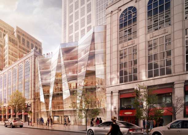
A recent proposal to squeeze an infill development into the courtyard of the 500 Boylston tower has received praise from urbanists and architects who argue that Boylston Street needs enhanced street life, denser development, and greater activation.  Generally, these tenets hold true on most streets in most cities, and while one of the lessons of Boston’s dalliance with Modernist urbanism in the mid 20th-century was that we should keep our streetwalls tight and our neighborhoods dense, infill for the sake of infill is a precept that we have a responsibility to question.  While CBT’s proposed design for the infill project is not a bad one, 500 Boylston’s courtyard is not a space we can afford to lose to a glass box, however engaging its undulations and renderings may be. I have written previously that as an architecture, 500 Boylston is more than meets the eye.  Rather than simply being another Postmodernist (PoMo in the parlance of the moment) office tower, Philip Johnson and John Burgee’s 1987 project for Hines Interests is actually one of Boston’s and Postmodernism’s greatest architectural lessons, and as such, is worthy of preservation in its current form.

The proposed infill development by CBT Architects, from the PNF filed with the Boston Redevelopment Authority.

The proposed infill development by CBT Architects, from the PNF filed with the Boston Redevelopment Authority.

bit of history: I have argued in the post linked above that Johnson/Burgee - but likely Johnson in particular - were using 500 Boylston as a way to show Boston and the world that pushing Postmodernism to its logical extreme is not the way for architecture to be moving.  The building is therefore both the style perfected and a scathing indictment of it.  At the time of its conception, Bostonians had fallen in love with Postmodernism’s faux-classical approach to architecture, which involved slathering buildings in every bit of ornamentation possible as a rebuff to the austere severity of Modernism, and PoMo towers were popping up all over the city.  Johnson, one of the greatest Modernists of his day, embraced PoMo’s oft-garish expressionism but ultimately returned to the purer forms of Modernism in his later work.  Nevertheless, Boston wanted PoMo, and the BRA was pushing the development of towers along Boylston Street as part of its High Spine masterplan.  Unsurprisingly, the development of 500 Boylston was still fraught with controversy.  Neighbors and neighborhood associations battled Johnson/Burgee and the original developers resulting in the elimination of a few floors (sound familiar?) and giving the tower its rather squat proportions.  The tower was ultimately built and dressed to the nines with every ornament Johnson/Burgee could throw at it, and when finished Bostonians decided they hated it.  What was supposed to be an identical tower next door was scrapped because of community opposition to the tower’s squatness and an apparent realization that Postmodernism at its most Postmodernist extreme was actually something quite distasteful.  Robert A. M. Stern was brought in to complete the second tower in a quieter, less opinionated fashion, and one can only assume that Johnson felt some vindication that Bostonians, it seemed, had learned their architectural lesson of the ‘80’s.  

500 Boylston seen from within the courtyard, its Palladian window form and courtyard ornamentation are highlighted. 

500 Boylston is a building we should respect not only because through its sagacious teachings it is a perfect architectural lesson, but also because it presents us with some very unique design.  As the ultimate PoMo building, the tower’s form is taken explicitly from the Palladian window, itself a classically ornamented fenestration designed by original “starchitect”, 16th-century Venetian architect Andrea Palladio.  But the real brilliance comes in the courtyard, the main part of the building currently threatened.  Here, Johnson/Burgee’s ornamentation really comes to life at the human scale.  Columns and arches fly overhead to aggrandize the main entrance. Pilasters, quoins, and balustrades break down the tower’s massing into architectural symbols that speak “power, strength, wealth, stability” causing almost every tourist or first-time passerby to stop and take a photo of a building that imparts a sense of timelessness despite being only 28.  What is it about the courtyard at 500 Boylston that feels so familiar?  It is oddly enchanting and inviting even if frequently unpleasantly windy.  The je-ne-sais-quoi of this place is that we have all seen it before, either in picture or in person.  It is a miniature, abstracted, replica of one of the most famous squares in the world: St. Peter’s.  Yes, The Vatican comes to Boston at 500 Boylston.  The curving arms of the tower’s podium mirror Bernini’s massive colonnades, the triptych form of the tower’s main entrance mimics the massing of St. Peter’s Basilica, and the proportional placement of the courtyard’s twin fountains is all but identical to those at St. Peter’s.  It’s true, the famous obelisk is absent, but is replaced by a small obelisk in each fountain.  This is not simply some slap-shod windswept plaza, this is the culmination of an entire architectural style.  Whether or not we agree with the conceptual foundations of Postmodernism, learning to recognize, accept, and respect its perfection is part of becoming the cultured, creative, global city that all Bostonians aspire to.  


The references to St. Peter's Square (right) are particularly evident when seen from above.

There will, inevitably, be backlash to my argument that 500 Boylston’s courtyard is a unique space worth saving, so let me take a few moments to respond preemptively.  First, to Equity Office Properties 500 Boylston’s current owner and would-be developer of the infill project, I understand that Boston’s current economic and development climate makes this opportunity hard to pass up, so let me offer an alternative.  When Robert A. M. Stern was brought in to design the neighboring tower, 222 Berkeley, he liked the idea that both towers should have some sort of open space and so built an atrium of about the same size as 500 Boylston’s courtyard in the interstitial building.  The atrium is essentially impossible for the public to access because of 222 Berkeley’s security, is massively underused even by the tower’s office workers who find it cavernous and banal, and would not be terribly desirable even if it were more accessible.  Infill there.  Yes, it would be more expensive to build into it than it would be to fill 500 Boylston’s courtyard, but you would preserve a space that will someday be seen as a crucial moment in American architectural history.  


Robert A. M. Stern's 222 Berkeley is seen at right in this drawing.  Its atrium is under the curved glass between 500 Boylston and 222 Berkeley.

To my fellow architects, urbanists, and spatial thinkers who argue that Boylston Street needs the activation that would come with this infill project: you are right – sort of.  To be honest, Boylston Street is in good shape as far as activation goes; you might consider focusing your advocacy elsewhere like Dudley Street in Roxbury or Blue Hill Ave in Mattapan.  Nevertheless, to replace the atrium at 222 Berkeley, Equity could place a retractable glass dome over Boston’s miniature St. Peter’s square and enclose its front with glass and doors without demolishing any of the existing details or destroying the building’s massing.  The result would be a publically accessible year-round space protected from the bothersome wind, not unlike Don Chiofaro’s Aquarium Garage tower proposal.  This enhanced courtyard could host more retail and dining options, and rethinking the way that the current retailers use the existing window bays could provide a more diverse interaction with the street.  (Do Talbot’s and Marshall’s really need to use every window bay both inside and outside the courtyard?  I don’t think so).  Ask yourselves, is infill for the sake of infill always the answer?  Should we scour the city filling every courtyard and gap we can find?  There goes the BPL’s courtyard, the windy, Brutalist Christian Science Reflecting Pool, and how about that silly Paul Revere Mall leading up to Old North Church?  What a waste of space right on Hanover Street! Certainly, some of these spaced could be filled without any great loss, but 500 Boylston’s courtyard is not one of them. 

Finally, to future architecture students, historians, and Bostonians writ large: if my advocacy results in the change of course I hope for, you’re welcome.  Here in 2015 Postmodernism is just beginning to have its moment, reflected by the fact that I can say PoMo somewhat un-ironically, and that the work of architects like Michael Graves is finally getting the recognition it deserves.  When you read this and Postmodernism has found its place in the pantheon of interesting if imperfect architectural styles like Modernism and Brutalism, please take a moment to go look at 500 Boylston and consider that it is the entirety of a style synthesized and perfected into one building.  If I fail, and 500 Boylston’s courtyard is destroyed, the building made impotent, and the cause of preserving Postmodernism’s worthwhile artifacts irreparably damaged, forgive me.  Forgive all of 2015’s Bostonians; Government Center, Central Artery, 500 Boylston – it seems that even when the master presents the perfect lesson, we cannot learn.  Truly, we know not what we do.  

This post originally appeared on BostInno.com.

"THE" and LA's New Geography

Perhaps as a result of a long winter that’s still hanging on for dear life in Boston, I’ve had warm places on my mind recently.  A phone call with a cousin who lives in LA prompted me to try to put into writing something I’ve been thinking about ever since my visit there two (warm, warm) summers ago.  I recalled that as I planned my trip I would ask friends I was hoping to see where in LA where they lived, and their responses invariably came in relation to highways: “West of the 405, north of the 10”, “In the Valley, just off the 5”.  I would usually have to ask "which Valley?" because LA has many and I quickly learned that “the Valley” means different things depending on where you live.  When I finally got to LA it felt like I was in an episode of “The Californians”, Saturday Night Live’s parody soap opera about Angelinos who speak only in terms of major roads and highways.  As I explored LA (I was determined to use only public transportation as a test of its efficacy), something bugged me about the way my friends and Angelinos writ large were speaking, and I slowly realized it was because of their use of one of English’s simplest words: the.  That was it, they used “the” strangely.  Never in my life had I heard people put our only definite article before a highway number, but they did it incessantly, not even questioning that one cannot have “the 405” because what is "a 405" anyway?  I wondered what were the special conditions that could cause the city-state of LA County to collectively - and seemingly unwittingly - decide to speak this way and what does this say about the way they perceive and interact with their space.

Morning rush hour on "the 5" (Author's collection).

Angelino’s use of “the” has aggrandized highways into geography.  Because of the way these megastructures dominate the city’s landscape and facilitate a complete ignorance of any existing natural geography they have become the only meaningful demarcation of space in LA.  LA’s auto-centric culture means that for millions of Angelinos, highways are the only type of geography they interact with on a daily basis.  Whereas other cities might define neighborhoods or regions by rivers, hills, or parks, when I asked if “East LA” meant east of the LA River, the most common response I received was “where’s the river?”  Responses from more astute observers of the built landscape were varied.  Depending on where they lived, East LA could mean east of the 405, east of Downtown, or east of  the “insert-north-south-highway-number-here”. Even though the LA River effectively separates Downtown from everything east of it and “the 710” follows the River for much of its course, not once did someone say “east of the river”.  Imagine if to define Cambridge from Boston one said “north of Storrow Drive” instead of “across the Charles” or to distinguish Manhattan from Brooklyn we said “on the other side of FDR Drive”.  Even in places where roads are used as defining boundaries, “the” is rarely used.  For example, Detroit is not defined as within “the 8 Mile”. 

Including on- and off-ramps, Highway 405 cuts a 28-lane gash through Los Angeles.  Soaring high in the air and creating a dark, empty space beneath it, the 405 easily provides a sufficiently vast urban chasm to encourage different types of development on either side of it. (Google Maps)

There are some crucial exceptions: when speaking about a highway as a noun, “the turnpike”, “the Beltway”, “le Peripherique”, our definite article is requisite because there is no other way to know which turnpike or because “inside Beltway” is terrbile grammar.  In Boston one might say “take the Pike to 128”, but never “take the 90 to the 128” because frankly, you would sound stupid.  Paris’s Peripherique is an extra special case, though.  A bounding highway built over the original city walls, it borrows its modern role as a definer of space from its predecessor, and even today is seen as a great divide between wealthy, museum-esque inner Paris and its poorer, economically depressed suburbs, though efforts are in place to change this as part of the massive Grand Paris masterplan and a comprehensive approach to creating an inclusive transportation system.

Another important half-exception is one that I hinted at above.  The one type of geography that Angelinos do seem to recognize, or at least reference, is “the Valley”.  However, the idea of “the Valley” as a depression between two mountainous areas separated from another area is completely lost because highways make traveling through complicated terrain so easy and the confusion as to exactly which valley is the Valley suggest that Angelinos aren’t even sure what “the Valley” is or means.  To most, the Valley is the San Fernando Valley, home of movie stars, mansions, and film studios, but in East LA (wherever that is), “the Valley” refers to the San Gabriel Valley named for the San Gabriel Mountains to the north and the San Gabriel River that flows through it.  Even before the current drought, however, the river was little more than a linear patch of mud that few would have noticed while soaring over it on the 10 or alongside it on the 605.  Every Angelino knows where the 110 is, but few could define the boundaries of “the Valley”. 

The City of Los Angeles is a confusing and discontinuous jurisdiction within the patchwork of cities that make up LA County. (Google Maps)

So irrelevant are the natural, geographic defining lines of human space to Angelinos that armed with their “the’s” and highway numbers, they are frequently unaware of where the City of Los Angeles ends and another city like Manhattan Beach begins.  When asked in my very informal survey, few could definitively decided whether or not Manhattan Beach was the same legal jurisdiction as Los Angeles.  Urban sprawl has led to a complete erasure of even those boundaries set forth by man in policy and law books.  All that remains as recognizable demarcation are the 8-, 12-, 16-, 20-lane car-rivers that fly like aqueducts 60, 80, 100, 120 feet in the air, causing tears in the urban fabric, shifts in street grids, and fluctuations in neighborhood economies that most elsewhere only geography has the power to do.

Left: Satellite view of the 110-105 Interchange, with Harbor Freeway Green and Silver Line Metro Station (Source: Google Maps).  Right: The view of Downtown LA from the Harbor Freeway Metro station, located vertically amidst the massive Judge Harry Pregerson Interchange, which has ramps that soar to 120 feet. (Author's collection)

The way that highways disassociate us from the standard human scales of time and space is a well-documented phenomenon, but in Los Angeles we see what happens when highways are the only scale of time and space.  The City, the County, the entire region in effect becomes tabula rasa regardless of existing built form under the crushing power of soaring highway pylons and massive cloverleaves.  Los Angeles is the only place in the world, that I know of, where the labeling phenomenon of “the” has taken hold so firmly that where denizens of other cities might say “the mountains” or “the river”, Angelinos will say “the 110” and “the 405”.  As our power to influence the built landscape at a massive scale increases, we must seriously question whether this lesson from LA shows that geography is replaceable if not replicable, and if so, what are the long-term consequences for a society that chooses this route?  How can you know how much water is in the river if you don't even know where the river is?

Mappuracy Matters

Over the past week, the MBTA has started rolling out their new maps, largely on Green Line trolleys.  I imagine the sudden release after months of silence regarding the fate of the winning map from last year's competition has something to do with the influx of visitors the city expected during Marathon weekend.  The Green Line and Silver Line to the airport are, of course, of particular importance to many visitors and runners.  Unfortunately, the new maps have a number of inaccuracies and confusing representational tactics throughout but especially along these lines.  A number of these problems are the result of the redrawing done to the map by the MBTA after it was originally submitted to them by Michael Kvrivishvili, but some of them were inherent in Kvrivishvili's map to begin with.  

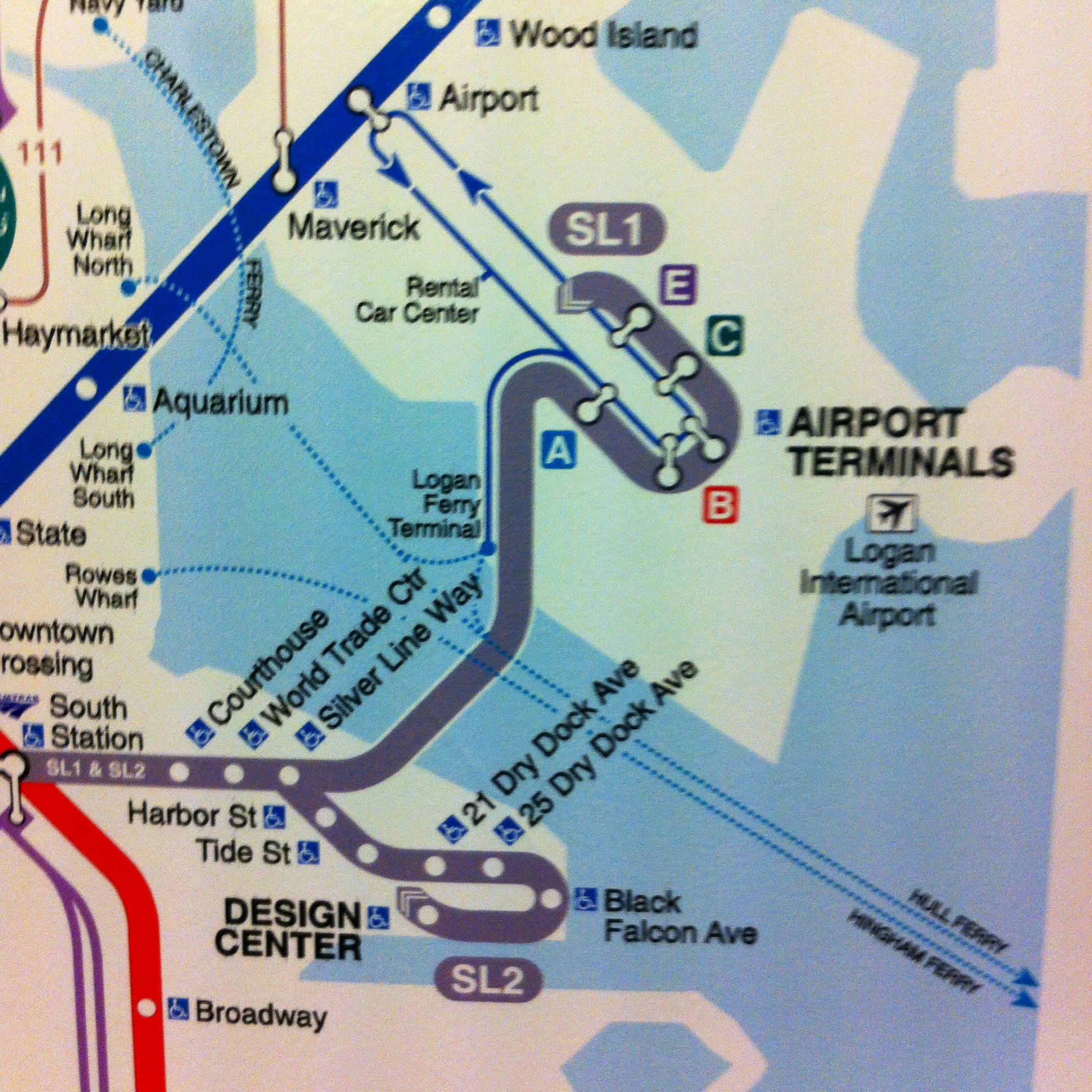
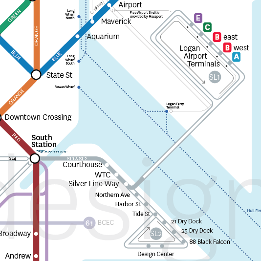
Now after having created, publicized, and garnered a bit of praise and publicity for my version of the T map (not to mention printing and mailing 4x4ft versions to Secretary Richard Davey and MBTA GM Dr. Beverly Scott), I am uniquely frustrated to find that the map of a man who has never even ridden the T is being put into place and providing the citizens and visitors of the city I love so fiercely with incorrect and misleading information.  The T's new map can be seen below on the left and my version of the map is on the right. 

It is simply embarrassing for our city.

It is a step away from the new Boston of innovation, excellence, and thoughtfulness that our leaders tell us they are trying to create and that we are all fighting to see shine.

And frankly, I don't understand how a city purportedly trying to retain young talent and reinvent itself through the inventiveness of homegrown designers, thinkers, and similar professionals, chooses inaccurate maps made in Russia over accurate ones made in Boston.  

Full disclosure: I had a brief conversation with MBTA GM Dr. Beverly Scott last night and she expressed genuine interest in working together to correct these problems, which may or may not lead to replacing the map.

Rant completed, below are my comments on the shortcomings of the MBTA's new system map.  The images on the left are of the new map, and those on the right are the correlative part of the system as represented on my version of the map.

Innacuracies

Silver Line

By far the most problematic part of the map and, to be fair, the most difficult to represent accurately, is the Silver Line to the Airport and through Seaport.  As the T's new map depicts it, the SL1 goes to Terminal E at the Airport, then turns around and hits all the other terminals on its way back into town (maybe).  In the editing process, the T made the route curvy for no apparent reason and added that silly little arrow at the end that tells riders basically nothing.  To me it says "the SL1 travels in only one direction.  It goes to Logan and never comes back - have fun taking the Blue Line to town!"  Basically the same is represented for the SL2 in Seaport.  

What actually happens at the Airport is that after Terminal E the SL1 continues on its route without stopping anywhere until it gets back to Silver Line Way on the other side of the Harbor.  For its part, the SL2 makes a loop around the Design Center, making two stops, and then meets back up with its route at Tide St.  All of these crucial differences can be clearly seen on my map.   

This is also a good time to point out the glaring omission of the entire Fort Point Channel on the new map - something I deem inexcusable particularly on a map that decides (for no reason I can understand) to underlay a georealistic outline of the city instead of a much cleaner, abstracted, and crucially malleable outline.  Leaving out such an important geographic feature will have significant negative impacts on how people perceive and understand where they are when in the Fort Point/Seaport/South Boston Waterfront/Innovation District in relation to the rest of the city. 

Wonderland Buses

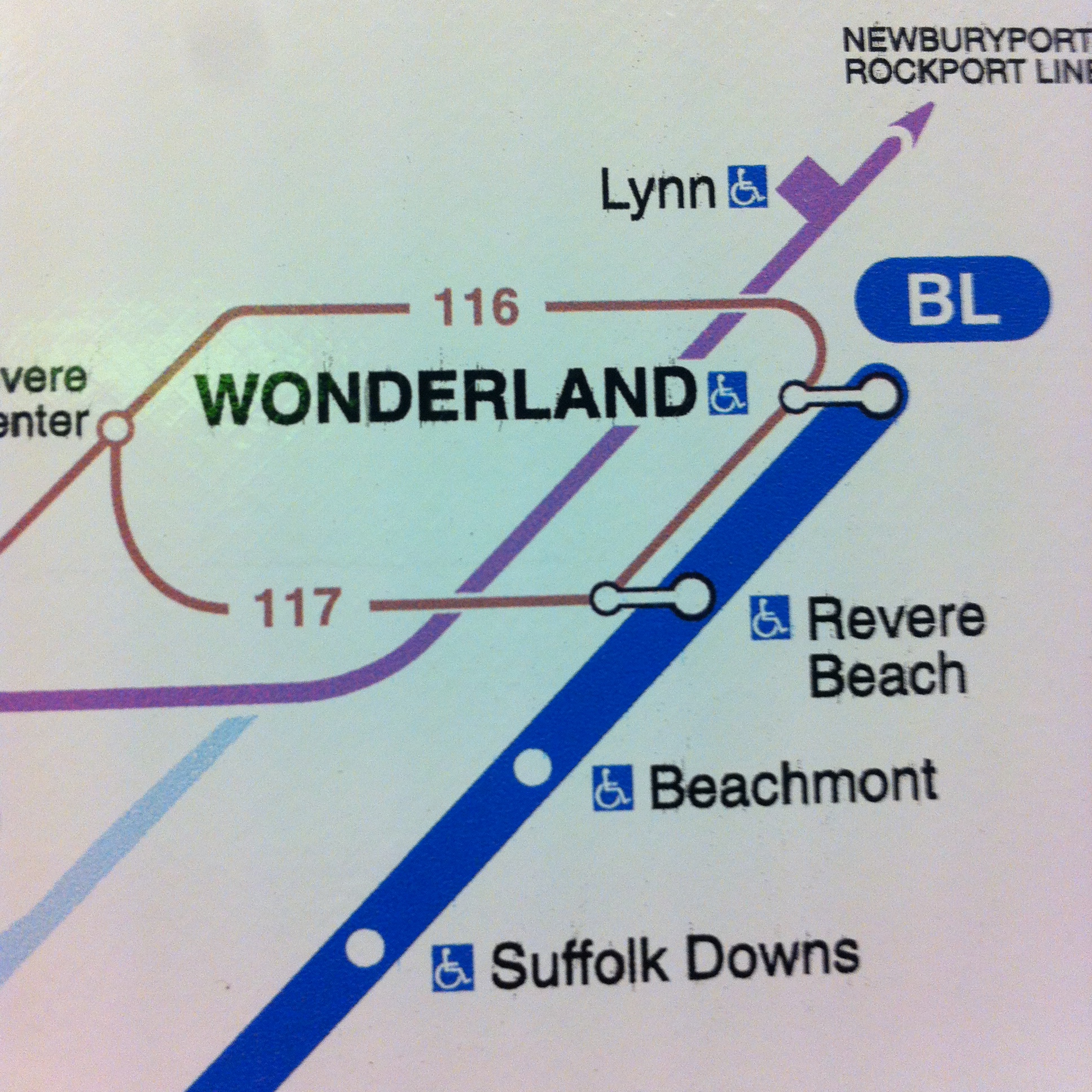
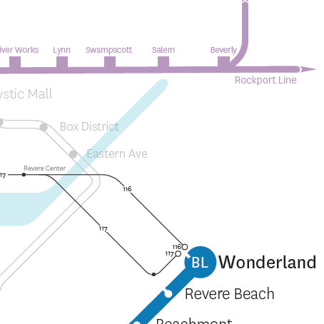
This has been a long-standing problem.  Because of the system of representation employed by the new T maps as well as the old ones, it is tremendously unclear what happens with the 116 and 117 bus, two routes that receive very heavy ridership and serve neighborhoods that are highly dependent on them.  The new T map suggests that the 117 stops at Revere Center (the brown dot on the left of the image), then Revere Beach on the Blue Line, then Wonderland, and then perhaps overlaps the route of the 116 to go back to Revere Center.  Similarly, it suggests that the 116's route is Revere Center, Wonderland, Revere Beach, Revere Center.  On my map, I made the important decision to show bus terminal stops so you can clearly see that the 117 terminates at Wonderland, and then retraces its steps through Revere Beach and Revere Center, and that the 116 also terminates at Wonderland and then heads back to Revere Center.  This is small, but so crucial. 

Dudley

Speaking of bus terminals, let's talk about Dudley.  Can anyone tell what's happening in the image on the left?  I honestly cannot.  The current representation makes it so difficult to keep the bus routes clear. By implementing a tactic for showing bus terminals on my map, riders can clearly see that the 1 and 66 buses end at Dudley instead of bleeding into other routes.  The same is true for the 15, 23, 28, and 22 at Ruggles where if it weren't for the terminals being shown it would look like all four routes overlap each other. Furthermore, I don't understand what's going on at the three Indigo Line stops that are shown.  Do the buses that go to each of them stop three times at each?  Is that what the three-pronged transfer means? On my map, passing through a station equates to a transfer - that seems fairly obvious.  Buses, particularly in Roxbury and Dorchester, are the workhorse of the MBTA and their representation on maps must be treated with care and precision.  

Confusions/Mistakes

Government Center

Showing that Government Center station is closed on printed maps means that within two years when the station reopens all the maps in the system will need to be reproduced, for such a cash-strapped agency, that seems a very liberal expenditure.  I feel that the stickers the T has been placing on maps throughout the system highlighting Government Center's closure are an ideal way to depict this. Additionally, the fact that the map doesn't have enough space to allow Government Center, one of the most important stations in the system, to have its label fully written out is concerning and doesn't bode well for any future expansions or edits.  

Angled Labels

It's generally agreed upon amongst transit mappers that angled labels are to be avoided as much as possible.  The new T map puts five of the most important Green Line stops, Kenmore through Boylston, at a 45 degree angle.  Furthermore, it repeatedly switches which side of the line the labels are on making for even more confused reading. 

This is also as good a time as any to point out that the georealistic map underlay makes for some very unsightly visual relationships.  Note how awkward "Hynes Convention Center" looks angled at 45 degrees against the Charles flowing by behind it.  

Green Line

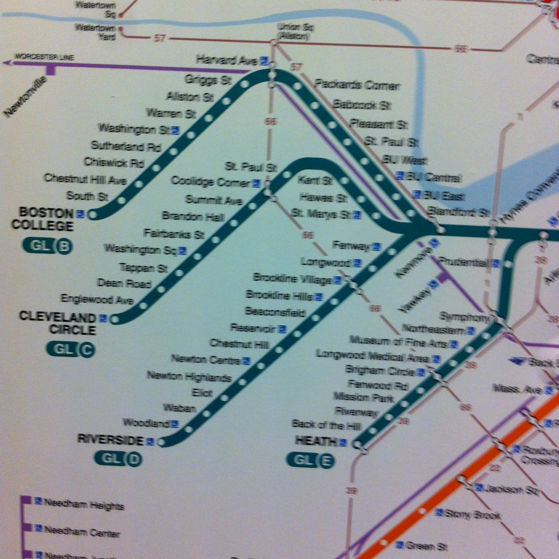
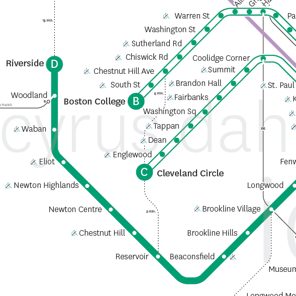
In addition to not showing that the B, C, and E branches are not grade-separated and therefore operate more like streetcars, the new T map also suggests that the D branch is about the same length as the other Green Line branches and that Riverside is somewhere between Cleveland Circle and Heath St.  Of course, this is not true: the D is approximately twice as long a line as the B and C and nearly four times the length of the E.  This, along with not showing anu difference between grade-separated and at-grade lines can lead to significant confusion about what the Green Line is, how it operates, and what options riders have when planning a trip. 

Round Your Stroke

This is small but really irks me: someone forgot to round the stroke in Illustrator on the D branch so the stop mark for Riverside looks nubby and like it's half outside the line when compared to any of the other line termini.  

Where is Chinatown?

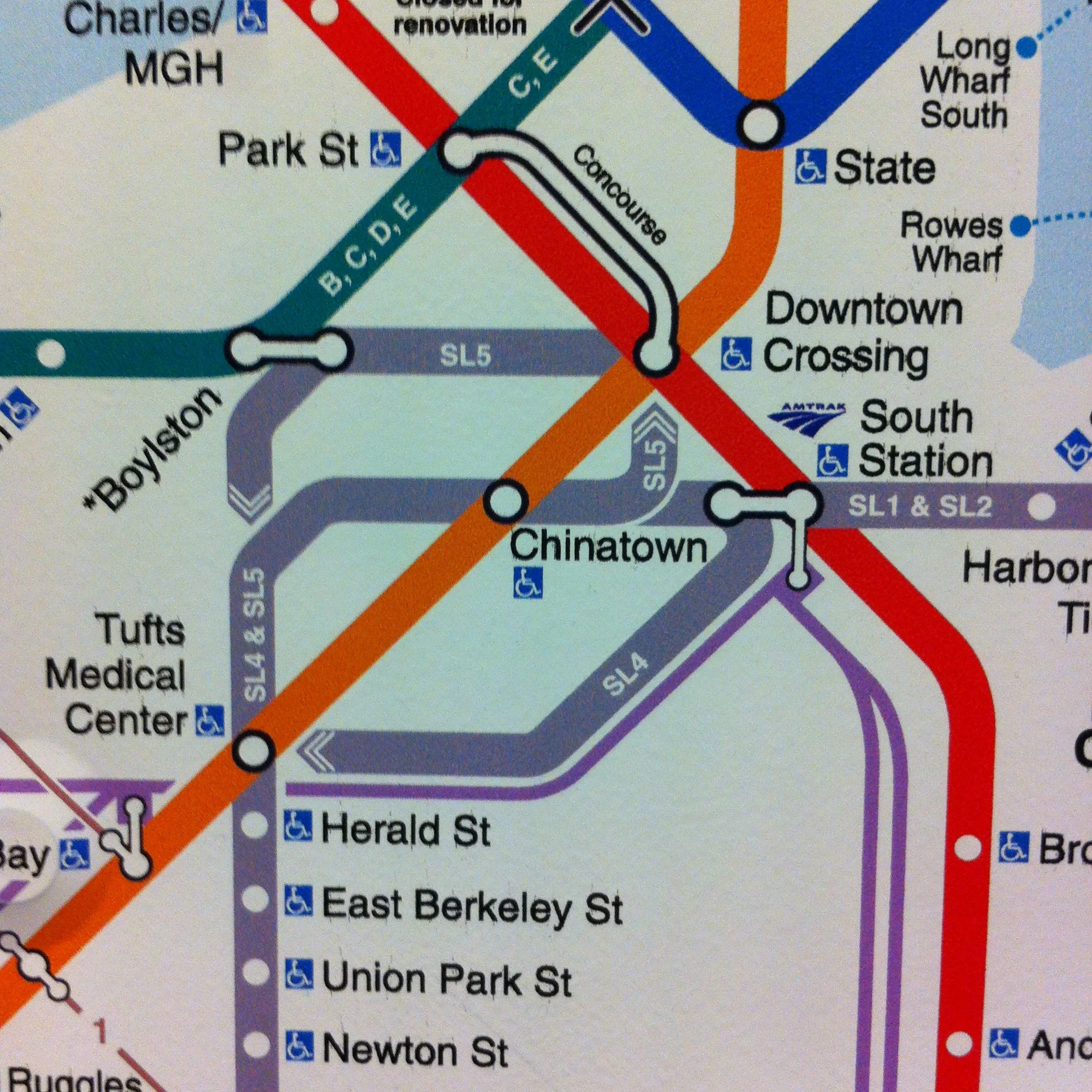
Partially because of the tightness that using a georealistic underlay creates for much of downtown Boston's depiction on the new T map, the label for the Chinatown stop on the Silver and Orange lines looks like it could apply to either South Station or Chinatown.  

There is also an incredible amount of inconsistency regarding SL to subway transfers.  The SL4 and SL5 never go underground or into any subway stations but the 1 and 2 do, this could be something worth noting on the map.  At South Station and Boylston it looks like the new T map is trying to illustrate this by using a split transfer symbol instead of a unified one like the SL1 and SL2 at South Station.  However, then the whole idea falls apart because a unified transfer symbol is used at both Tufts Medical Center and Chinatown where the SL4 and SL5 definitely do not go underground or into the station.